“This Is My” YouTube Series Launch Campaign
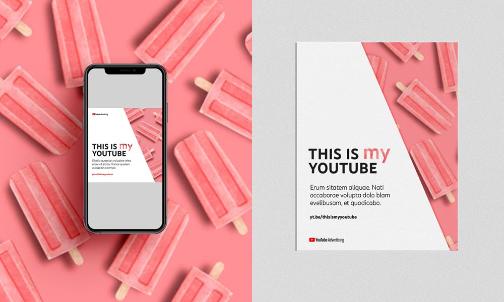
Refining an established campaign through a simple, ownable visual device.
Agency: HandsDown!
Client: YouTube
What I did: Brand ideation, lock-up design, brand guideline design, creative direction, presenting concepts to stakeholders
Role: Creative Lead (Independent)
This project focused on refining the visual language of an existing global campaign, building on a well-established platform and idea rather than reinventing it. The challenge was to bring greater clarity and structure while maintaining recognisability and scale. Within the existing campaign framework, I introduced the lowercase my as a typographic framing device. Used consistently, it created a clear and ownable way to contain and present a wide range of content, allowing for variation while bringing cohesion to the overall system. Working within YouTube’s brand guidelines, I developed visual assets and guidance that could be applied across formats and markets.
Result: The result was a cleaner, more considered evolution of the campaign, strengthening consistency without overcomplicating the idea.


